
This work is password‑protected
Don’t have the password? Email me.
Incorrect password — try again.
← Back to all work
Don’t have the password? Email me.
Incorrect password — try again.
← Back to all workCase study — Checkout.com
Flow Remember Me lets shoppers save their card once and pay in one click at any merchant on Checkout.com’s network.
I designed the first-time and returning journeys across web and mobile.
Customisable payment components, reducing payment and operational friction for buyers and businesses.
Shoppers re-entered payment details at every checkout, increasing friction and abandonment.
Partnered with a UX researcher to benchmark leading one-click checkouts and analyse consumer research across 18,000 shoppers in 16 markets. Three key insights emerged.
What erodes trust and loyalty when paying online, besides price
Merchants integrate the payment component into their own brand. Shoppers save a card once and pay in one click across the network.
Ready-to-deploy payment components that seamlessly adapt to each merchant’s brand across web and mobile.
Enrolment happens once, within a checkout the shopper is already completing. Every return, at any merchant on the network, follows the same two steps: verify, then pay.
Saving is one tick inside the payment form.
The checkout combines contact, shipping, billing, and card details, with a single opt-in at payment. Ticking it confirms the shopper’s details and saves their card across the network.
Verified by the email they already enter.
Their email retrieves their saved details. A one-time code, sent by email, SMS, or WhatsApp, confirms it’s them before anything is shown.
From recognised to paid in one click.
Saved addresses and cards appear pre-filled, so payment takes one click. Details remain self-serve: every card and address can be edited or removed at any time.
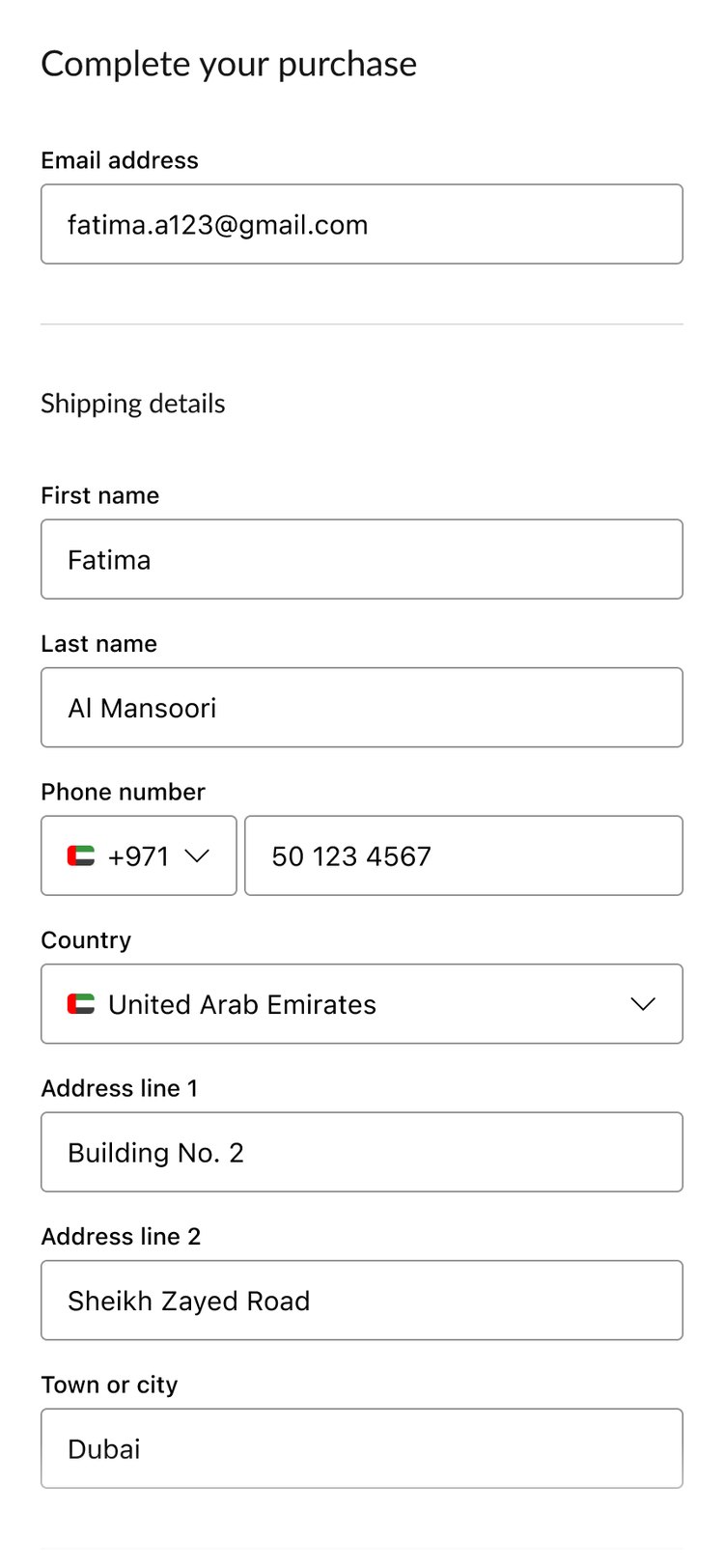
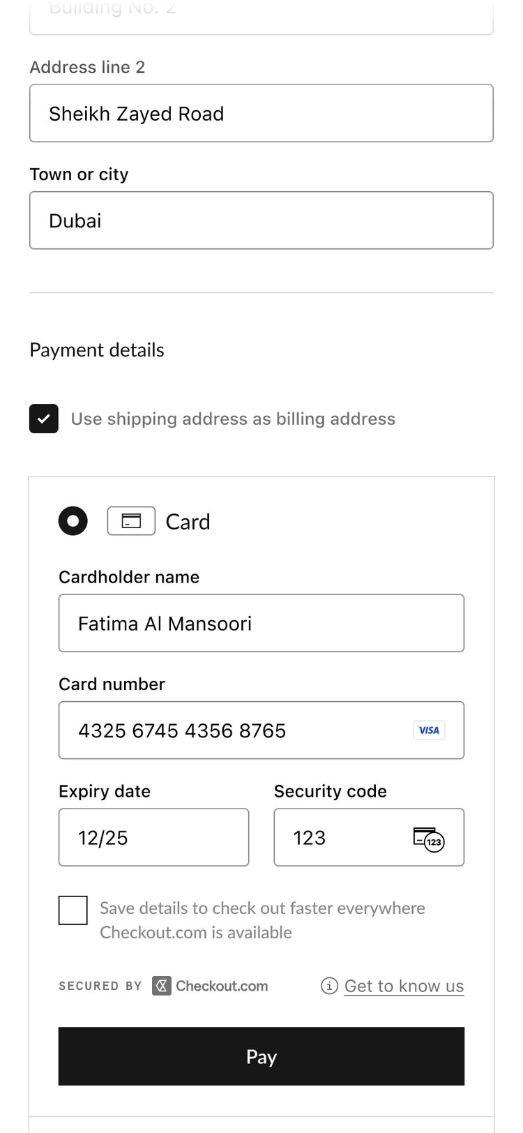
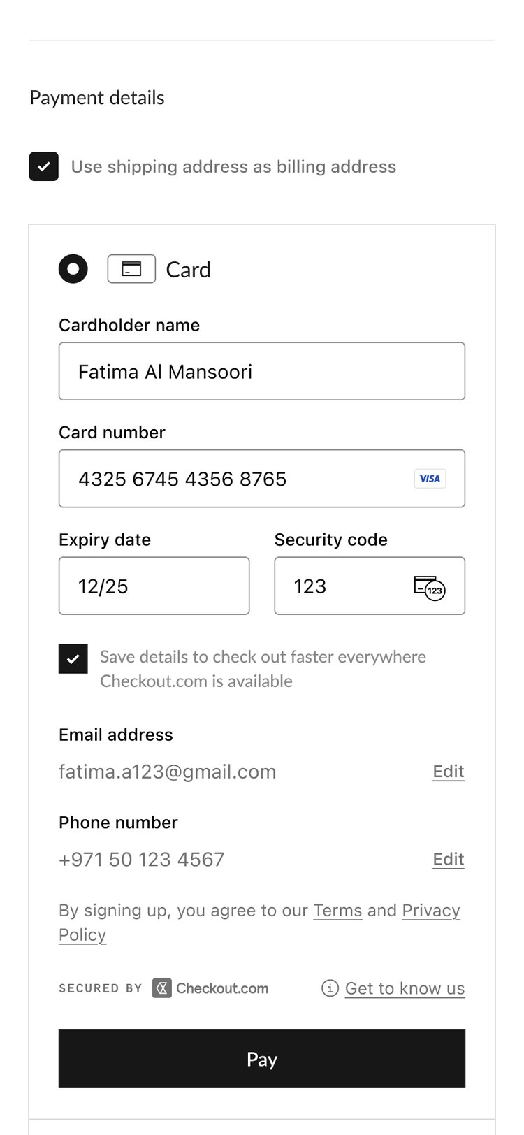
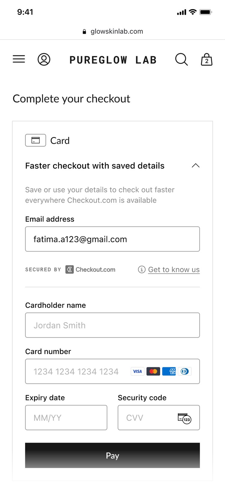
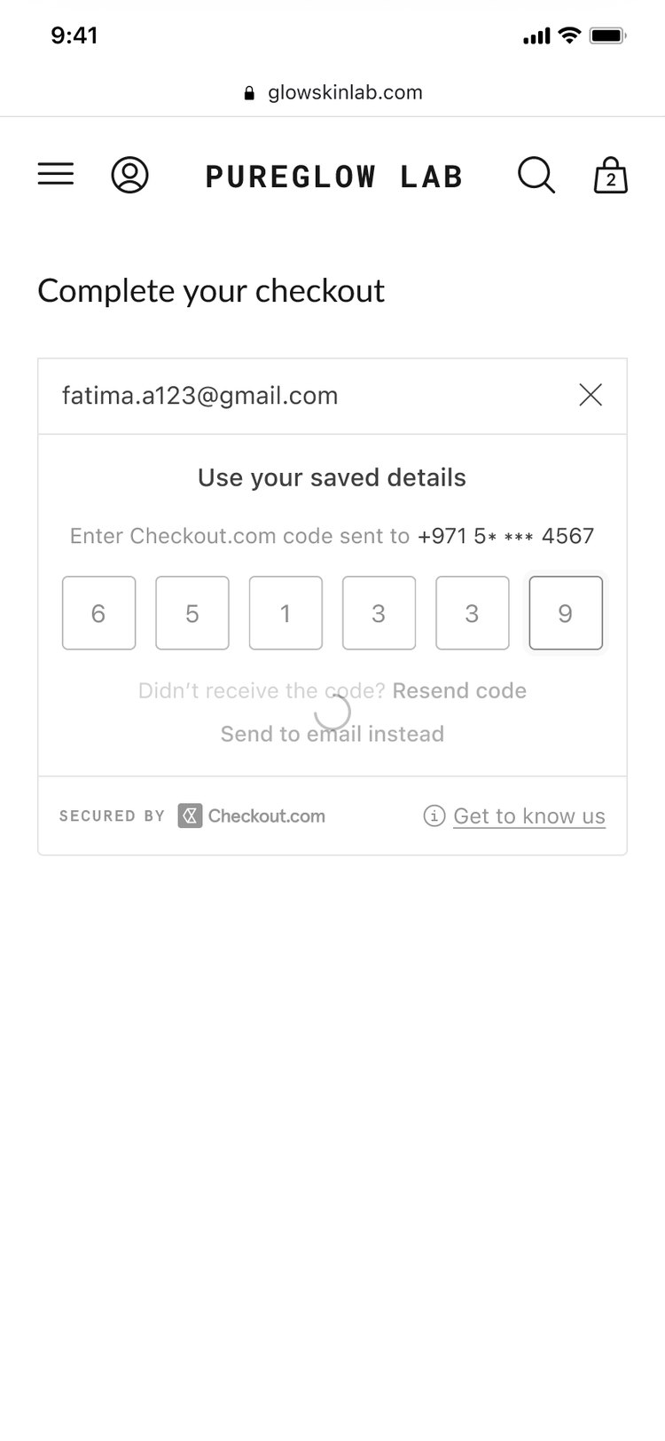
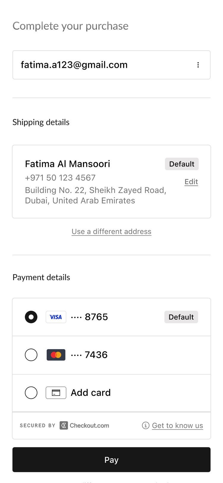
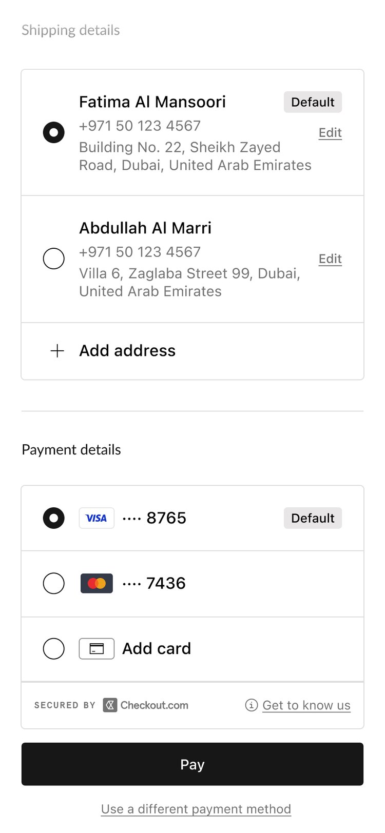
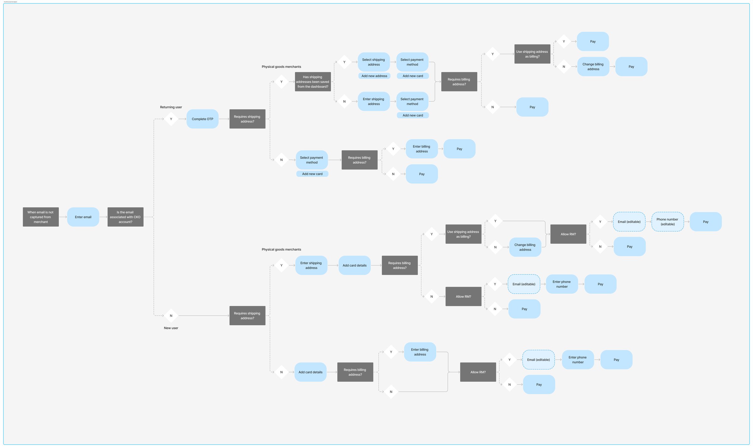
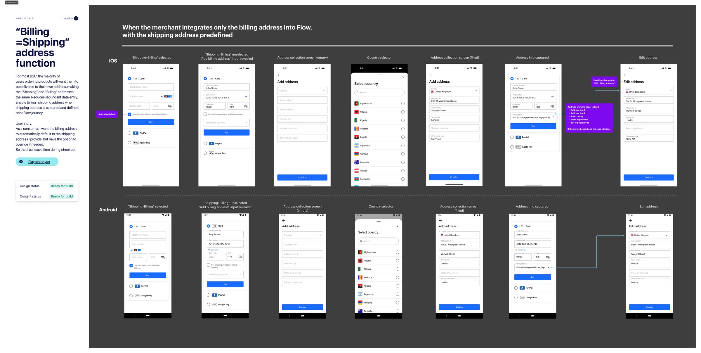
Behind the three stages sits the full logic: one decision tree covering every path a shopper can take, and a build-ready spec for each function, annotated state by state for both platforms.
Flow renders inline, inheriting the merchant’s fonts, colours and borders, so the entire journey stays within their checkout.
Enrolment was kept to a single opt-in during the first checkout. The design effort went into the return visit: from email to paid in one code and one click.
A saved card works across the whole network, so consent had to stay visible after purchase: a confirmation for every payment, plus a self-serve card dashboard.

Next: Babylon Health — The First Encounter Experience · Thank you