This work is password‑protected
Don’t have the password? Email me.
Incorrect password — try again.
← Back to all work
Don’t have the password? Email me.
Incorrect password — try again.
← Back to all workCase study — Babylon Health
Babylon’s original registration wasn’t built for the complexities of US healthcare. I led the redesign, increasing sign-up completion from 60% to 93%.

Babylon’s US registration felt like a helpline transfer queue. We rebuilt it around insurance, consent and families, and every metric moved.
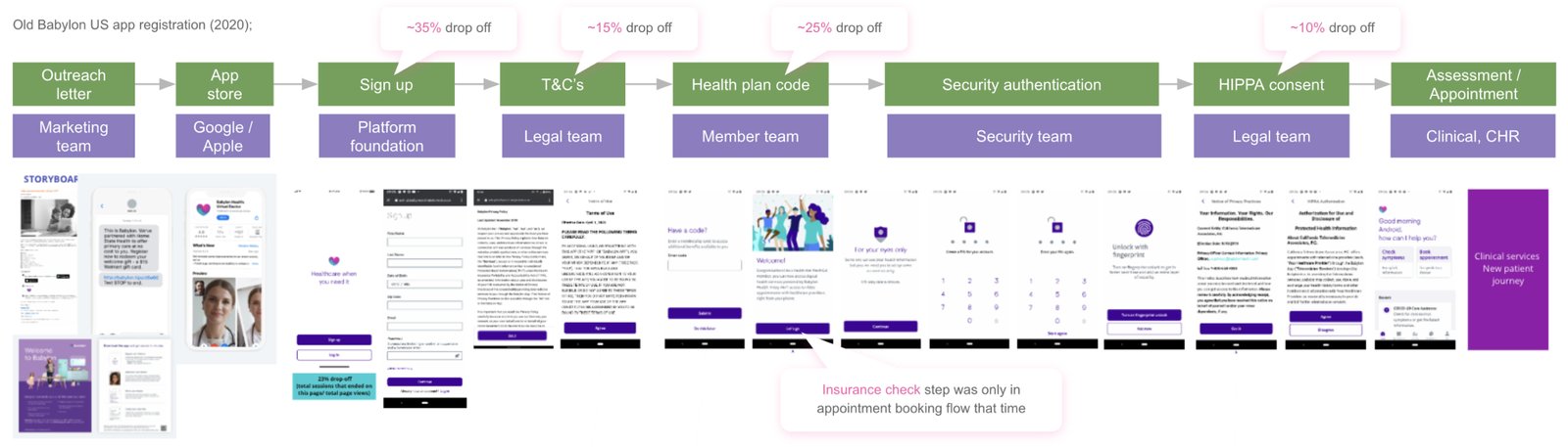
Ever been bounced between five departments on a customer helpline? Babylon's US onboarding felt the same. Each step in the journey belonged to a different internal team — marketing, legal, security, clinical — and users could feel the organisational seams.
Registration was inefficient for onboarding and verifying eligible members, with no intuitive path for managing dependents’ health.
Those who did start found a journey that leaked at every hand-off:
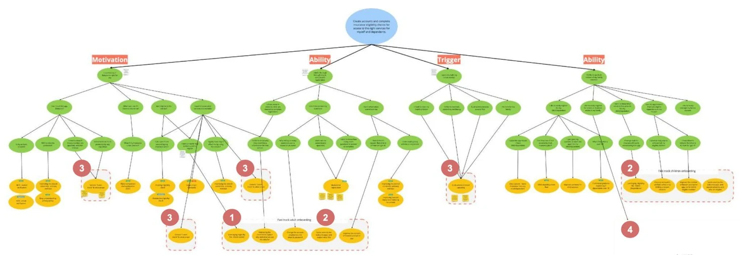
Each pain point became a design question:
Users were unsure how the service worked with their insurance, questioned the value on offer, and wanted clarity on legal compliance before committing.
The journey asked too much of users while explaining too little — a tedious form with no sense of progress or purpose, leading to confusion and abandonment.
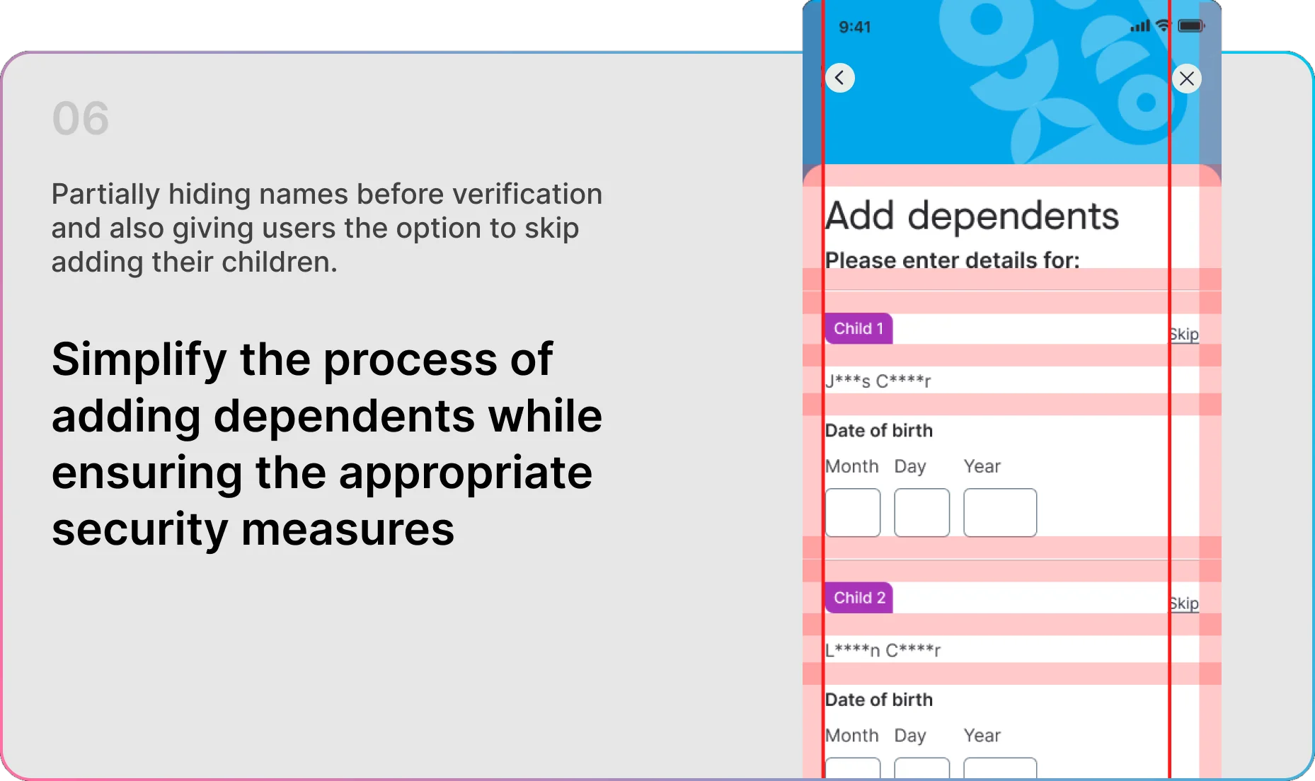
Onboarding centred on the individual adult, neglecting parents and carers who needed to manage the health of children and dependents.
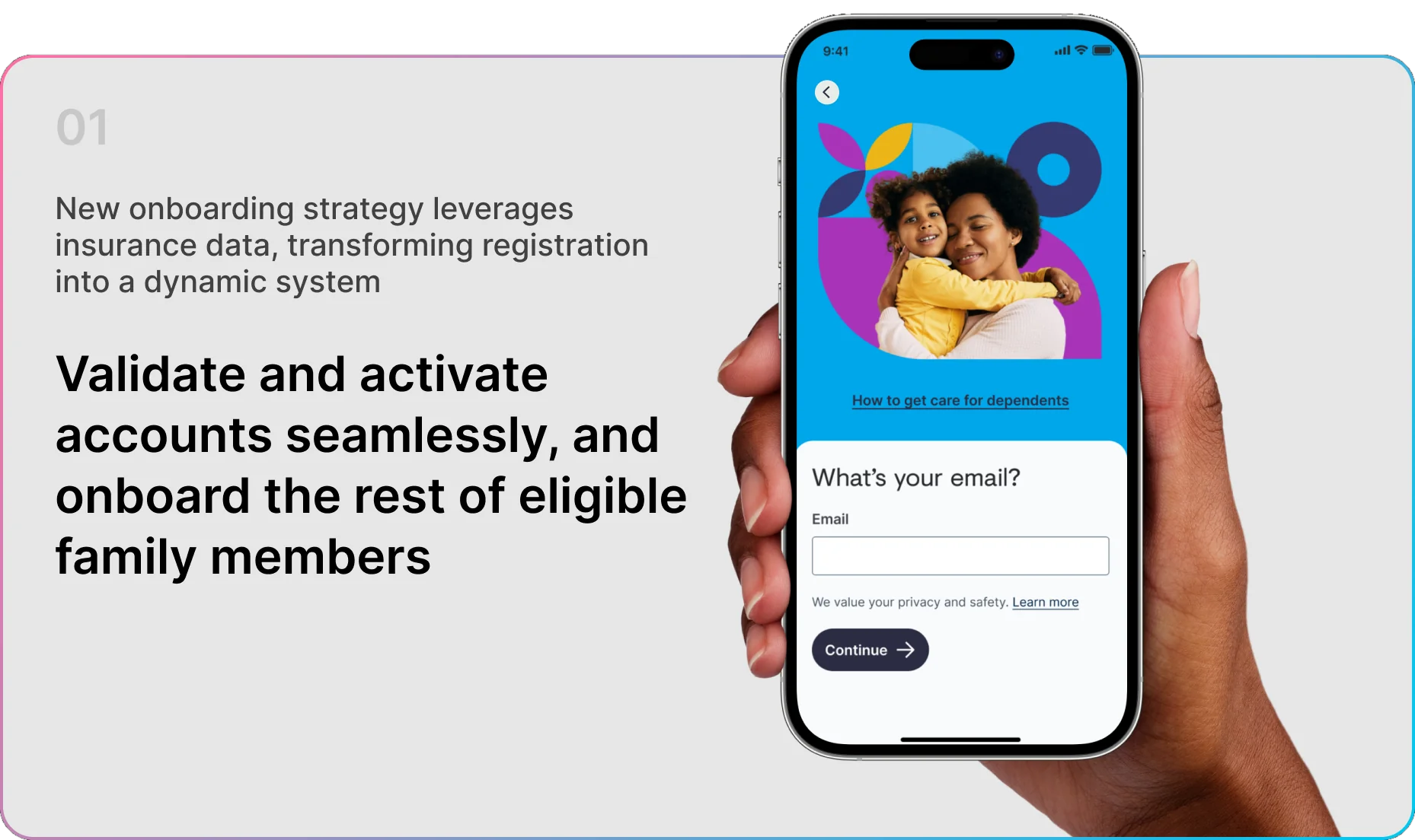
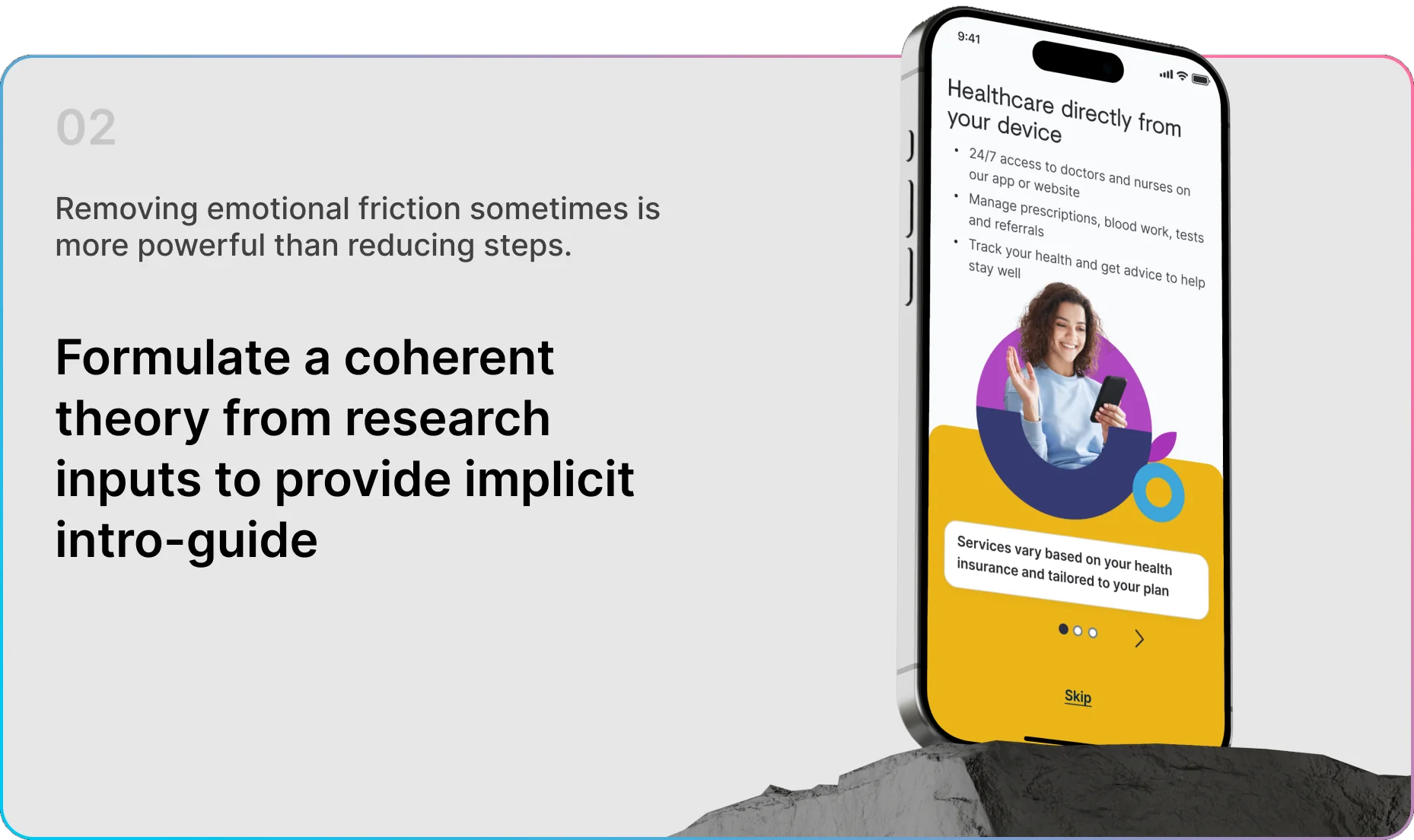
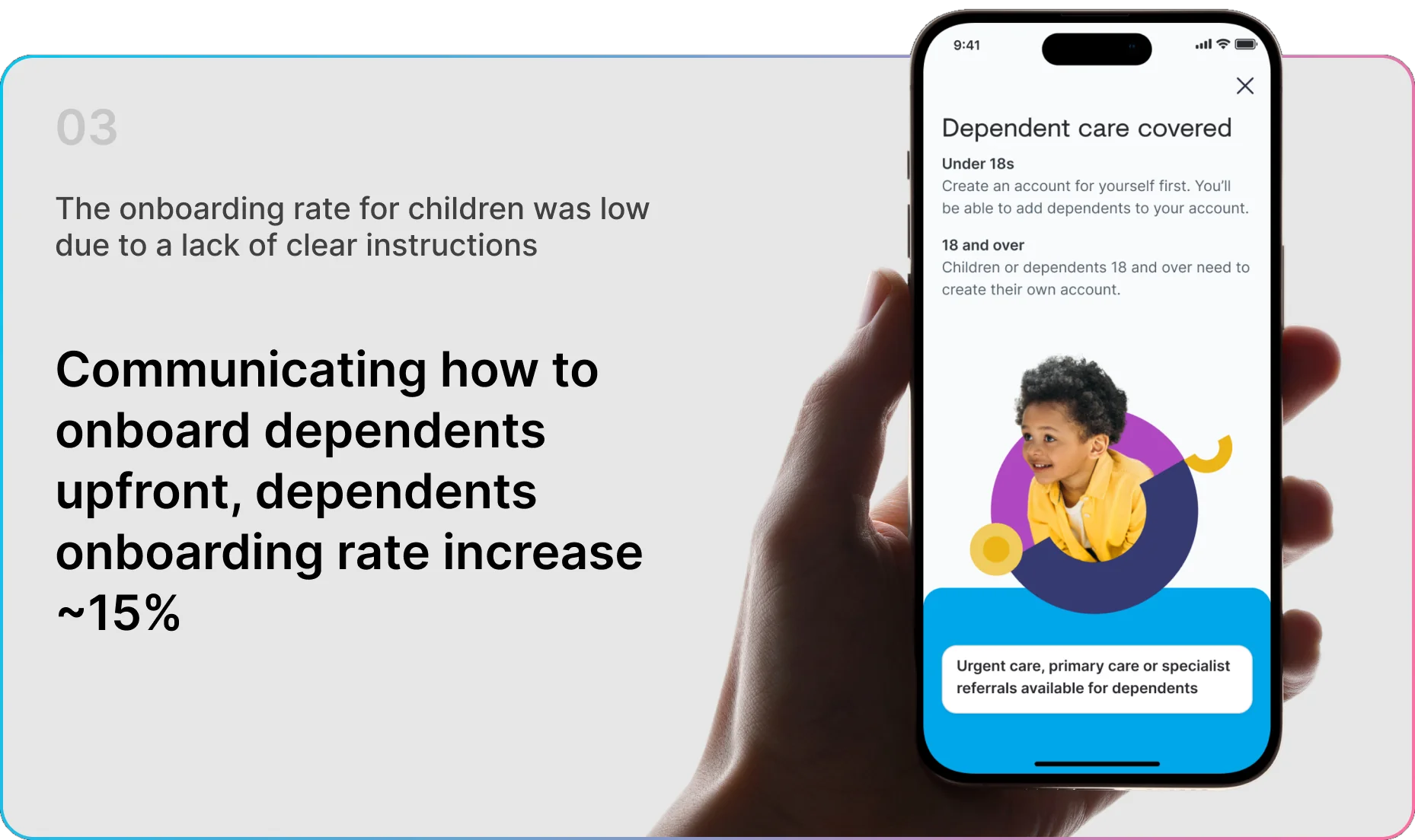
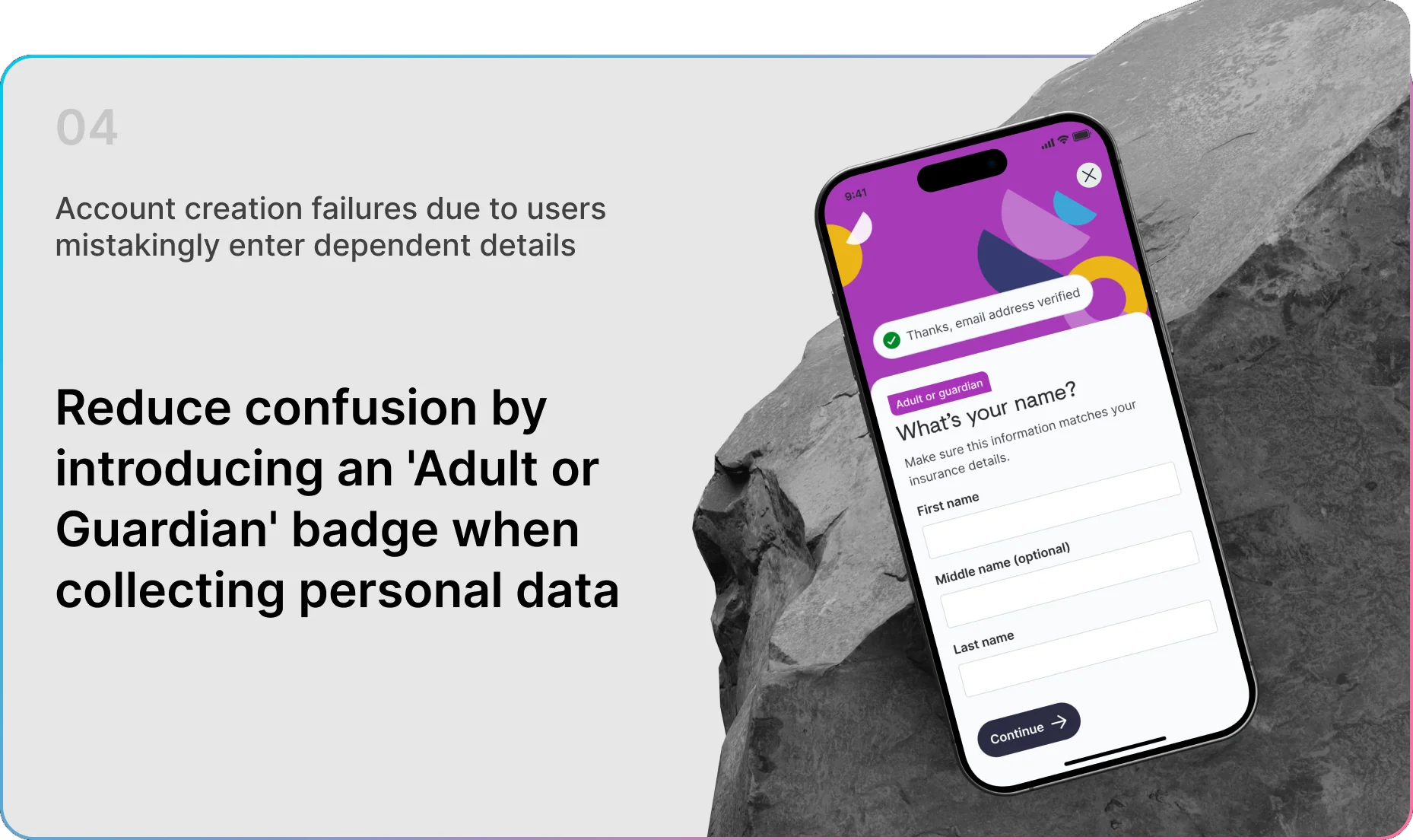
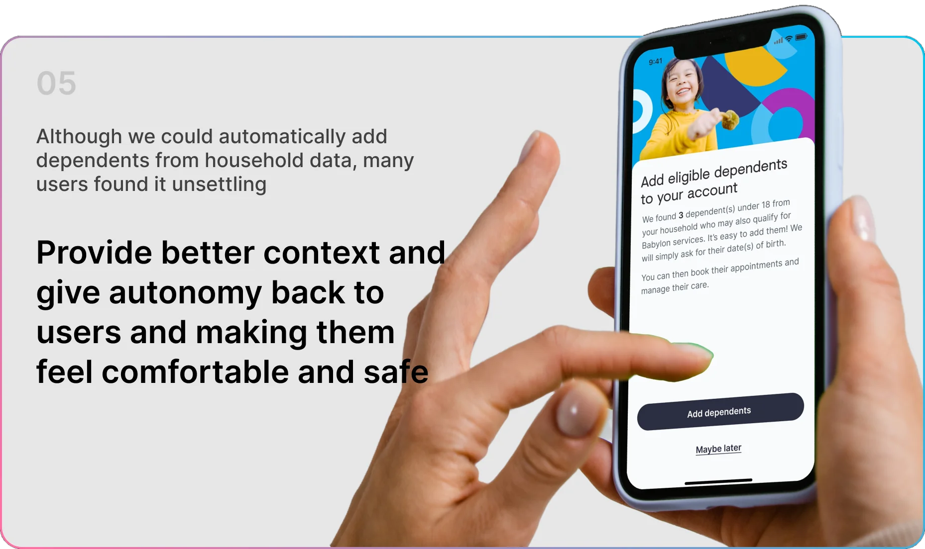
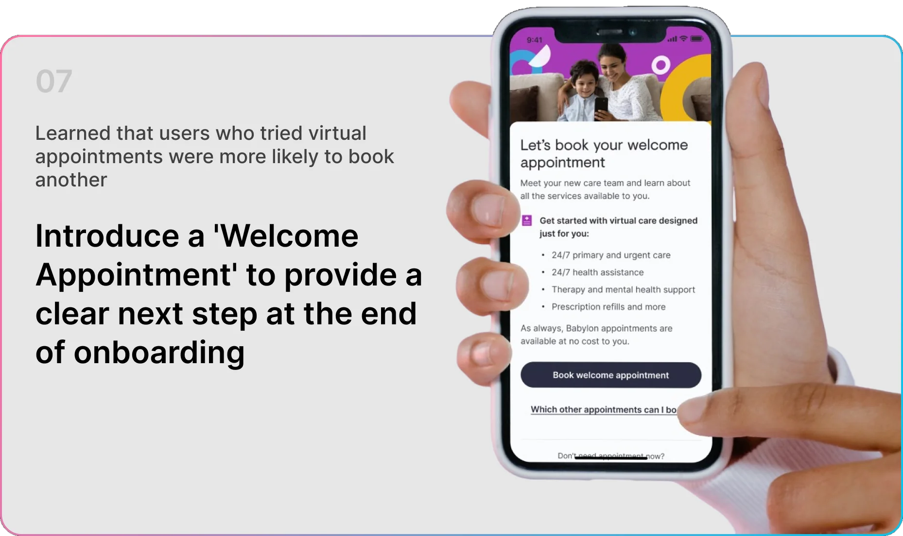
The A/B test said the quiet part: faster onboarding lost to trust-building. We kept the intro guide and spent the friction where it earns belief — removing emotional friction beat removing steps.
Auto-retrieving insurance data was technically easy and emotionally wrong — participants found the unexpected disclosure invasive. Autonomy became the rule: explain, play back, and ask first.
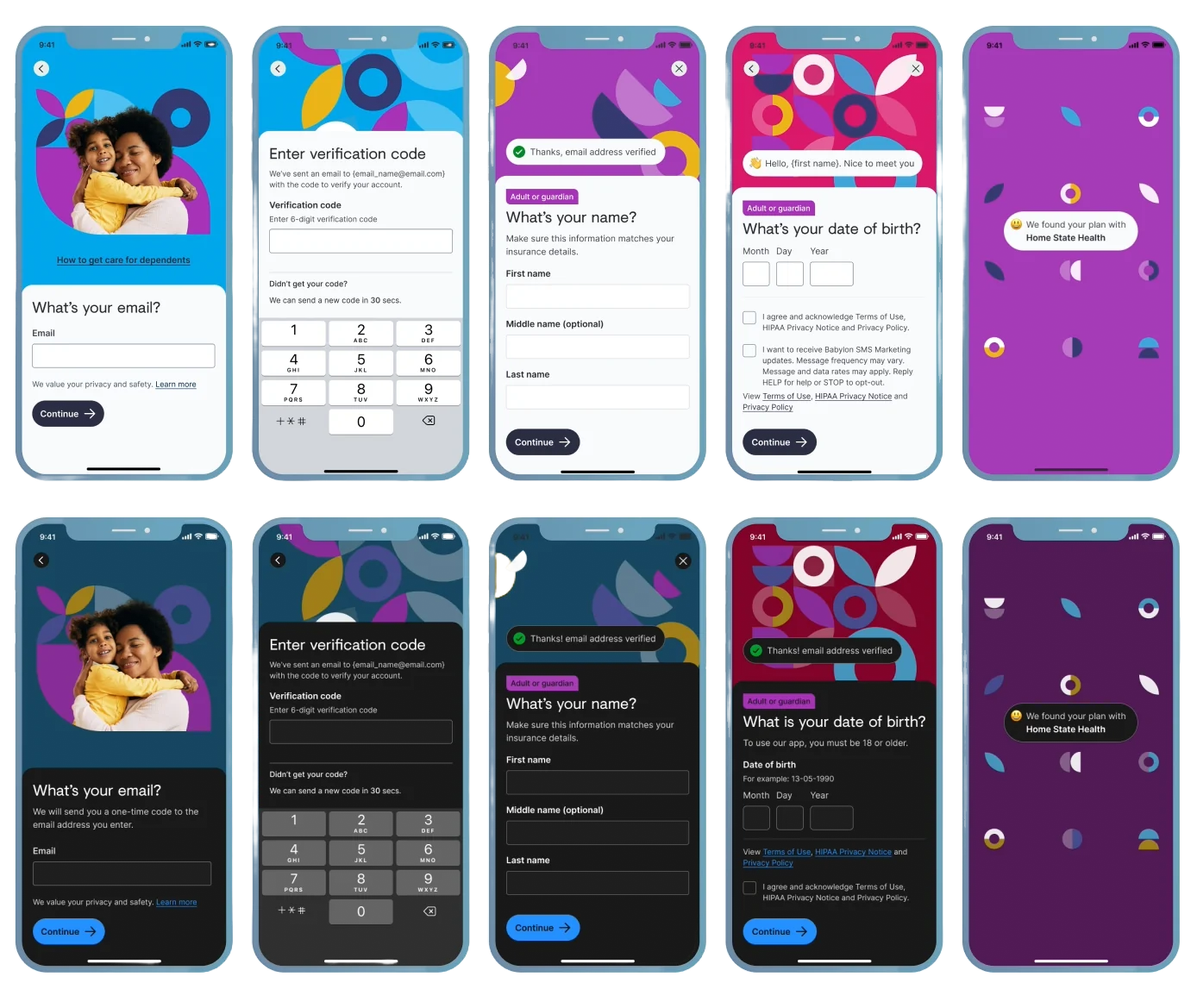
US healthcare law requires three pieces of personal information at minimum, so registration collects only those three. Everything else waits until it's needed.

Next: DOJO — Enhancing billing · Thank you